REVIEW Jan 2026 ‘Frances Priest: Motif | Line | Colour’ at Blackwell
Kirsty Jukes
Frances Priest Gathering Bowl: Grammar of Ornament: India I (2017) Inscribed ceramics with vitreous slip glaze. Courtesy of the artist. Image credit: Robin Zahler
Art historian and writer Kirsty Jukes reviews Frances Priest’s Motif | Line | Colour, a solo exhibition covering a quarter century of the ceramicist’s work at Blackwell: Arts and Crafts House, Windermere. This exhibition follows Priest’s evolution from her early monochrome pieces to more recent, intricate, and colourful designs. It showcases work from her latest collection, Unfixing, rarely seen pieces from her personal archive, and newly created works inspired by the architecture of Blackwell. Priest’s ceramics are known for their bold patterns, vibrant colours, and deep attention to decorative detail. Drawing inspiration from a wide range of cultures and historical periods, her work explores the power of ornament to tell stories, evoke a sense of place, and celebrate the joy of being human. ‘Frances Priest: Motif | Line | Colour’ is on view until Saturday 11 April 2026.
"Form without colour is like a body without a soul".
Owen Jones, The Grammar of Ornament (1856)
This sentiment, taken from the design folio The Grammar of Ornament by Victorian theorist and architect Owen Jones, can be observed as a guiding principle of ceramicist Frances Priest’s work. As a child, she was given a copy of this influential book by her parents and avidly read each description while absorbing the vibrant line and pattern of printed illustration tiles.
Just as the creators of these designs used culturally traditional techniques to delineate their intended forms, so too did the resulting patterns mark themselves into the psyche of the young Priest. Like an internal archive of historical design principles, Priest used this mental library to create her own modern translations of ancient, global design languages. Motifs from Asia, Africa and elsewhere mix confidently with those from the British Arts and Crafts movement to create unique, playful and reverent work.
The popularity of this book was such that other writers tried their hand at creating similar versions. Auguste Racinet's Historic Ornament (1869) and Heinrich Dolmetsch’s The Historic Styles of Ornament (1898) for example, explore design histories from around the world whilst expanding on the possibilities of printed patterns in book form. Collections such as these were extremely popular with the public during times when travel abroad was reserved for the wealthy. Knowledge obtained during these trips was kept within privileged circles. Intrigue driven by Orientalism in the Victorian era encouraged a glut of Britons to seek out cultural enlightenment by ‘collecting’ what they deemed to be exotic. Items and experiences from outside of this country created a certain sense of ownership over the unknown and gave status to those who could demonstrate understanding. Homes, public buildings and palaces were adorned in a more global style and this country became less austere as a result. The influence of these books extends into contemporary design with many artists and craftspeople of today mixing time periods and national styles.
Looking through it myself, it is very clear which motifs had a lasting effect on Priest. In particular, you can imagine her tracing her finger over the lines in Egyptian, Byzantine, Arabian, Moresque, Persian and Chinese designs committing them all to memory. In the final pages of the book are overlapping prints titled ‘Leaves from Nature’ which can also be seen as inspiration in some of her works. In a further work by Jones titled Plans, Elevations, Sections and Details of the Alhambra there are even more examples of Spanish and Islamic tilework echoed in Priest’s oeuvre.
International influence speaks to her experience as a child growing up in Wakefield, a northern industrial town home to a variety of beautifully ornamented buildings. More recently, she has realised the global origins of that vernacular. It speaks to the nature of empire in the story of the UK and its effect on our own design culture. To steal, to borrow, to appropriate has long been the Western way. She feels that her motifs, although new, also have a kind of familiarity for her audience as she brings lots of influences together in unusual ways. By trying to open up a conversation about the origins of these ornamental motifs, she does the work to unpick appropriation in a visual way and recognise the fact that the international influence on British culture is to be both noticed and celebrated.
Since graduating from Edinburgh College of Art in 1999, Priest has built an internationally respected career in both the private and public art worlds. Her work is held in collections globally and in major UK institutions including The Fitzwilliam Museum, The Victoria & Albert Museum and The National Museum of Scotland. Priest is influenced by designer and potter William De Morgan, abstract painter Bridget Riley, fellow ceramicist Alice Walton and tile manufacturer Craven Dunnill Jackfield among others too many to list. Although her practice is made up of mainly three-dimensional ceramics, it is rooted in drawing and pattern drafting. To map out the complex motifs in her vessels, she first sketches two-dimensional grid-like forms to ensure accuracy of tessellation with no gaps or overlaps.
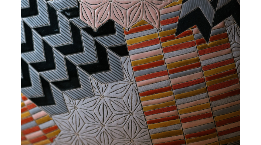
Frances Priest Drum Form | Chevron / Stripe / Asanoha (2019) Inscribed ceramic with vitreous slip, glaze and hand-drawn enamel decals. Courtesy of the artist. Image credit: Robin Zahler
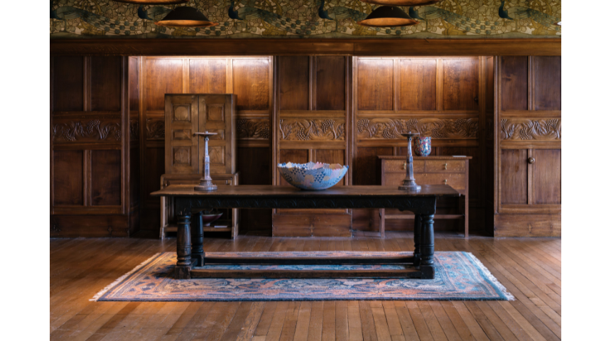
The resulting works have a precious quality to them with extra attention given to lustrous surfaces and saturated colouration. Complex patterns lean into the stylisation of modernism, a nineteenth-century Western movement also heavily influenced by global design motifs. At Blackwell, Priest’s early works are given ample space on plinths and windowsills upstairs. They are very formal, in an almost Hepworth-esque sculptural style that explores spatial relationships. They also have a sense of the architectural, and in Priest’s words, “explore line and form, surface and shape in conversation with each other”.
In 2005-06, she was lucky enough to be invited to exhibit in Japan and also worked in Southeast Asia. Here she encountered cultures where ornament, pattern and colour were primary and widely celebrated. This residency resulted in Priest compiling a physical reference library of designs in the form of photographs of motifs she saw in countries such as Japan, Cambodia and Laos. In doing this, Priest added to the work of Owen Jones and his contemporaries by draughting an ever-growing repository of designs from all over the world from which she could draw inspiration. Her 2009 Scottish Gallery, Edinburgh exhibition, Objects of touch & travel, acted almost like a postcard of all of those experiences. From that show onwards, travel remains her main focus.
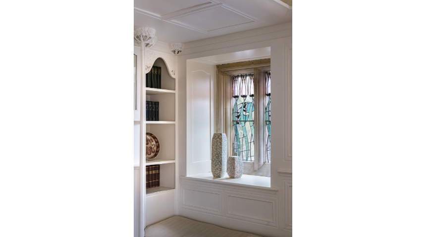
Priest feels hugely privileged to be showing work at the Blackwell as the building and the ethos of its architect, Mackay Hugh Baillie Scott, epitomise much of what she aspires to as an artist and craftsperson. He introduces romance and symbolism into elements such as wood-carving, leaded lights, ironwork, plasterwork and stencilled motifs. In each space, Priest’s designs sit in harmony with their surroundings. For her, to be able to situate her work in conversation with this building is very special. Harmony between time periods and styles is particularly evident in The White Room, a bright space set apart from the deeply coloured wood interiors of the rest of the building. Overlooking Lake Windermere, this room is calm with clean lines and serene natural sunlight that diffuses through stained glass to glance off Priest’s work. Here, she uses the reflected colours of the floral windows and the chalky white surfaces of the walls in pieces that look as if they have always been there.
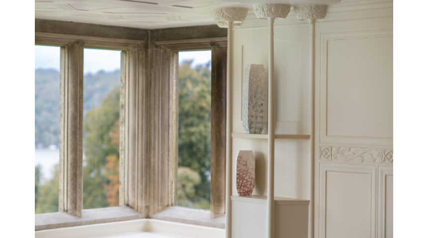
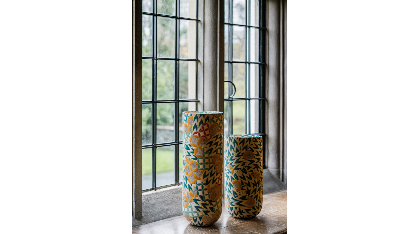
Frances Priest White Drawing Room Collection | Petal 1, Chevron 3 (2025) Hand built ceramic with inscribed line and vitreous slip. Image credit: Robin Zahler
In 1901, Baillie Scott submitted designs for the House for an Art Lover, an ‘ideas competition’ organised by German publisher Alexander Koch, that earned him an international reputation as a gifted architect. The blues, reds and pinks from his competition drawings have been colour matched in Priest’s delicate chevron and petal motifs adorning tall closed vases sat in alcoves around the room. Working closely with Blackwell Programme Curator Naomi Gariff, Priest cites the opportunity for research trips to the Blackwell archive as key to planning this exhibition. There were numerous visits in the run up to Motif | Line | Colour during which the artist was able to make her own decisions about where to place objects around the house which she describes as “such a treat”. The floating geometry of works in her Unfixing series are examples of how ceramics can be found in unexpected forms and places. They float in the white cube spaces like sections of brightly coloured parquet flooring, mother of pearl tiling, tonal jigsaws and windblown encaustic flowers that have broken free from their stems. Each of these brings up a tactile urge in me to feel the glossy sheen of their incised surfaces.
“The work that I make now really is about languages of pattern, just in their own right, for the joy of them, but also looking at their origins, the kind of histories and stories that they might reveal, their connection to place, and my work spans a studio practice right through to a design project practice and projects in the public realm, where I'm collaborating with a town manufacturer and I'm making large scale tile works for interior spaces. So, I guess that sort of passion for people, I suppose, and people's relationship to ornament and pattern is something that I'm exploring through all of those different outputs of my work and the opportunity to come collaborate with other craftspeople as well. So sometimes I'm a maker and sometimes I'm a designer working with other makers. And I think ornament is like that as well. It's a very democratic art form.”
Frances Priest, November 2025
Frances Priest Vase Form - Chevron: Huxtable (2019) Inscribed ceramic with vitreous slip and glaze. Courtesy of the artist. Image credit: Robin Zahler
The sheer breadth of work in this show is demonstrative of Priest’s adaptability to each commission. Some pieces are made for private galleries and collectors including beautiful Japanese style boxes with bamboo motifs lent back to her by her parents and rarely seen in public. Others are commissions such as The Tiled Corridor project in which she decorated the halls of Royal Edinburgh Hospital in 2018. Pleasing ochre and teal tiles were created by a team of twenty ceramicists to add an uplifting and positive element to a clinical environment. Imbricated like fish scales, they overlap in shaped rows much like Roman roof design that found a revival in Victorian design. As a mental health setting, there were all sorts of considerations required for this project.
For Priest, this was a very different way of working. She considers herself more of a designer on projects in the public realm and enjoys the challenge of seeing how her ideas can rub up against the real world. To be able to apply craftsmanship and things of real beauty to that kind of setting is so important, because it humanises and speaks to the quality of care in these spaces. It's not just about the patient experience, but also the professionals that work there and creating an environment that is actually joyful to be in and can provide moments of respite in a difficult day. The great thing about tiles is that they're so tactile, and so it's an interactive artwork. They're both glamorous and incredibly durable so it is a lovely combination both visually and tangibly.
What was most beautiful about this exhibition was seeing myriad influences sit in harmony with each other throughout Priest’s work. Her research and travels are apparent as she neatly describes for the viewer a world outside of our windows. Her obsessive collecting of forms and ideas appeals to me personally as, in my own practice, I moodboard, collage and assemble images that move me to inform my writing. It is an act of remembering that then translates into a form of fuel for creating anew and is something Priest has practiced to perfection. The curation and placement of works in the space is thoughtful and definitively situates her practice in a timeline of design. Wandering through the history of the building itself only to have my eyeline punctuated by Priest’s fresh designs is a pleasurable experience, like dopamine hits in the form of variously beautifully glazed pots, boxes, plates and tiles. Repeated patterns linked together or floating apart in beautiful palettes most definitely speak to the aesthete in me as I am sure they will speak to others: meditative and calming in the most wonderful way.
Frances Priest Vase Form, Byzantine VIII (2023) Ceramic form, inscribed line, earthenware glaze and vitreous slip. Courtesy of Cavaliero Finn. Image credit: Robin Zahler
‘Frances Priest’s Motif | Line | Colour’ runs until Saturday 11 April 2026 at Blackwell: Arts and Crafts House.
Entry included with museum admission. Lakeland Arts members and Annual Pass holders go free. Pre-book tickets online here.
This interview is supported by Lakeland Arts.